ACCESS REQUIRED
ENTER CODE TO VIEW CASE STUDY
ENTERPRISE INSURANCE PLATFORM
FOR EVEREST REINSURANCE

OVERVIEW
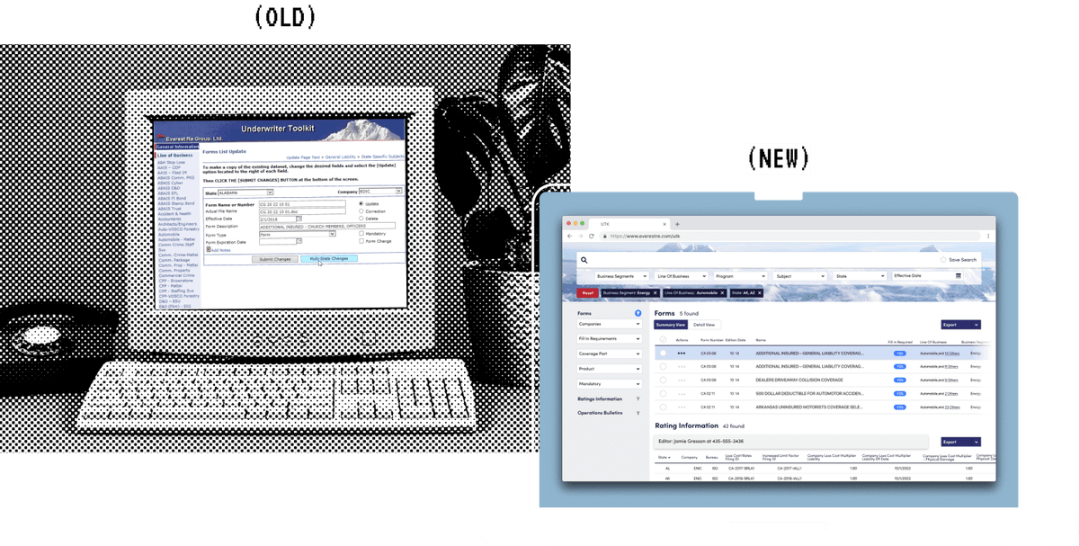
As a Senior Design Consultant at Capgemini, I led the visual design for Everest Insurance's document management system overhaul. This project was a perfect example of taking an old-school problem and crafting a modern solution. The existing system was a legacy .NET application that underwriters struggled with daily – slow, clunky, and frustrating to use. What made this project special was that the core technical needs were straightforward, which gave us more runway to deeply understand user needs and push the design further than usual.
PROBLEM AND GOAL
Everest Insurance approached us with a clear problem: their underwriters were losing precious time wrestling with an outdated document management system. The existing application was showing its age through poor usability and constant user complaints. They needed a modern solution their development team could implement, and they needed it within 6 weeks.
Our deliverables included:
- Comprehensive research findings
- User flow documentation
- Wireframes
- High-fidelity visual designs
The technical solution was clear – we'd be recommending a modern JavaScript framework for the front-end with a robust document server backend. This clarity on the technical approach meant my research partner and I could focus our energy on user needs and creating an exceptional experience.
Wireframe Documentation
Initial wireframes and user flow documentation for the document management system redesign.
View Wireframes →Admin Workflow Analysis
Detailed analysis of administrative workflows, including content management, communications, and review processes.
View Analysis →PROCESS
Working as a tight two-person team, we divided and conquered. My colleague led the user interviews while I started exploring visual directions. Together, we synthesized findings and built out the user flows and wireframes. Over the first two weeks, we conducted in-depth interviews with 10-12 underwriters and admins, documenting their workflows and pain points.
The interviews revealed that users were struggling with a decade-old system that forced them to navigate through multiple levels of dropdowns just to access common forms, missing simple features like global search and batch export. Underwriters were spending significant time downloading forms one by one for each claim – a process that should have been much more streamlined.
METHODOLOGIES USED
- Contextual user interviews
- Information architecture mapping
- Rapid wireframing
- Visual design exploration
- Stakeholder workshops
Through analysis of user workflows and system constraints, we identified that a tag-based system would reduce document retrieval time significantly. The simplicity of this solution meant we could invest more time in crafting an engaging visual experience.
VISUAL DESIGN STRATEGY
The visual design opportunity came from an unexpected place – Everest's office environment. Their recently remodeled office space in North Jersey featured floor-to-ceiling Mt. Everest graphics and even included a playful yeti mascot near their cafeteria. The underwriters' enthusiasm for these brand touches was clear, especially since their own work areas were still pretty bare-bones.
I saw an opportunity to bring some of that brand energy into their daily tools. During our workshops, I engaged the underwriters in helping shape the visual direction, using their company's namesake as inspiration. We explored ways to incorporate subtle Everest imagery and their brand colors into the interface, making sure it remained professional while adding some personality to their daily workflow.

Design System Components and Documentation
KEY ACHIEVEMENTS
- Designed a streamlined tag-based system that significantly reduced document retrieval time
- Created an engaging visual design that connected with Everest's brand identity
- Provided immediate usability improvements through CSS modifications to their existing system
- Delivered comprehensive documentation for their development team to implement
RESULTS
This stands out as one of my favorite consulting projects, largely due to the dynamic I had with my research partner. Our complementary skills and clear role definition meant we could move quickly from low-fidelity to high-fidelity designs. The depth of our user research gave us rock-solid confidence in our recommendations, which proved crucial in stakeholder presentations.
The project was a success both short and long-term. In the immediate aftermath, we provided CSS modifications that improved the usability of their existing system while the new one was being built. Today, the new system is fully implemented, and I'm told they kept the Everest mountain photography as their application background – a small but satisfying detail that shows how well our design resonated with their team.
This project highlighted the value of balancing user needs, technical constraints, and brand identity. By taking the time to understand not just how users worked but also their environment and company culture, we created a solution that was both highly functional and personally engaging for its users.